
Crate — Designing AI Evolution
The Team
• 1-2 Designers
• 2 Product Team
• 1-3 Engineers
My Role: Founding Designer
Impact: Designed Crate’s original AI bookmarking app from the ground up, then led its evolution into a proactive AI discovery platform over five years—shaping the product, design systems, and brand across mobile, desktop, B2C, and B2B experiences.
Total downloads
200 k +
Platforms shipped
5 (iOS + Android + Web + Browser Extension + B2B)
AppStore rating
4.6
The product
Crate is an AI-powered discovery and personalization product for the AI Era. It learns from user-generated signals and saved content to generate a living Taste ID, then uses that to power a visual, editorial home feed.
The Opportunity
Designing a product from day one is a fun puzzle. Redesigning it while the market shifts, technology explodes, and the business model pivots? That’s an entirely different kind of challenge, still fun though.
Over five years as the founding designer at Crate, I led the product’s visual and functional evolution centered around an ever-changing AI technology. This is the story of how we navigated a massive pivot without losing our users, turning a simple digital locker into an intelligent, welcoming platform.
Act 1
It Started with AI Organization
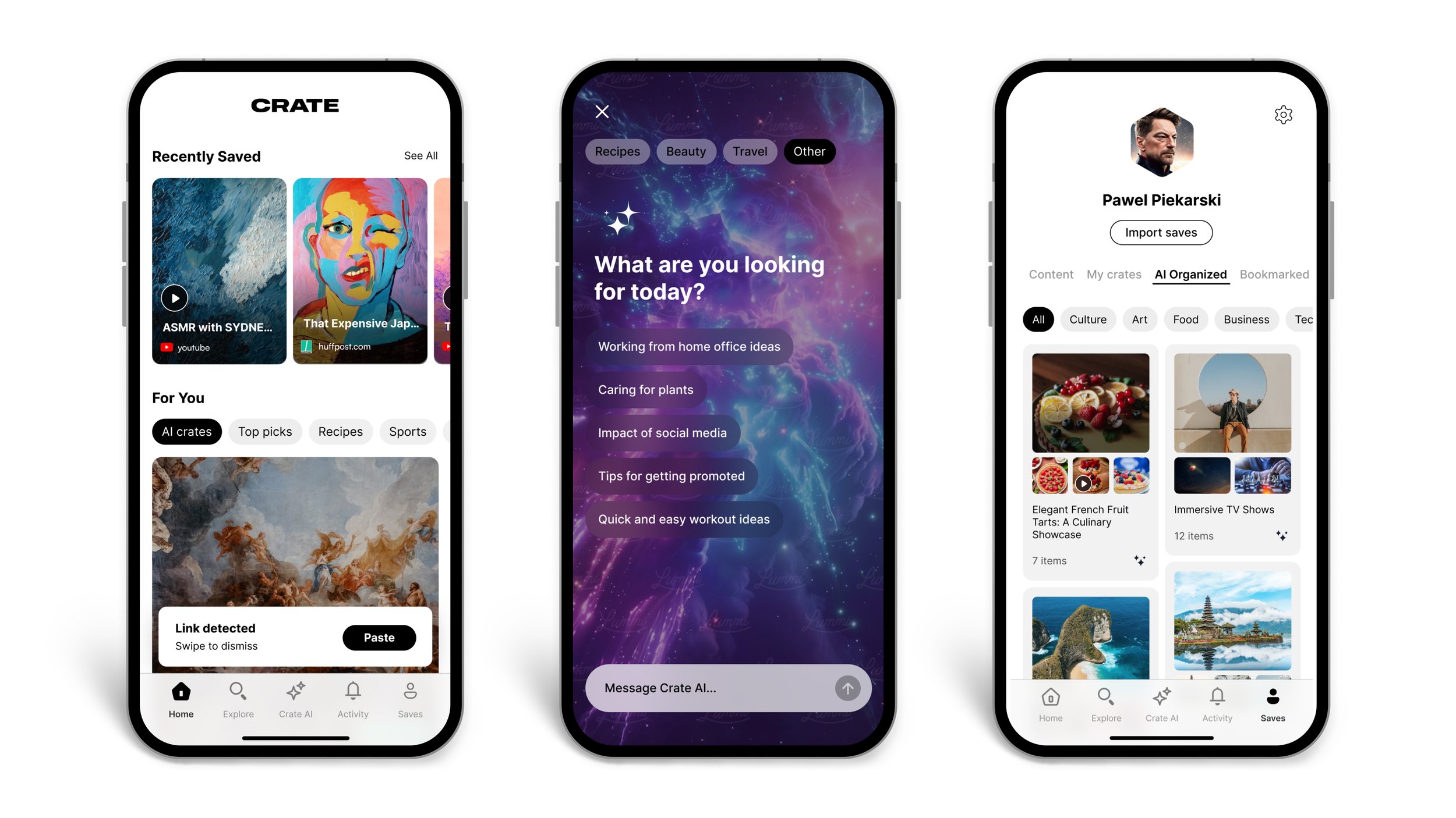
In the beginning, Crate was built to solve a simple problem: digital hoarding. We all save links, articles, and inspiration, and we never look at them again.
I designed the V1 of Crate to be a frictionless, clean utility. The goal was to make saving and organizing with AI as effortless and intuitive as possible.
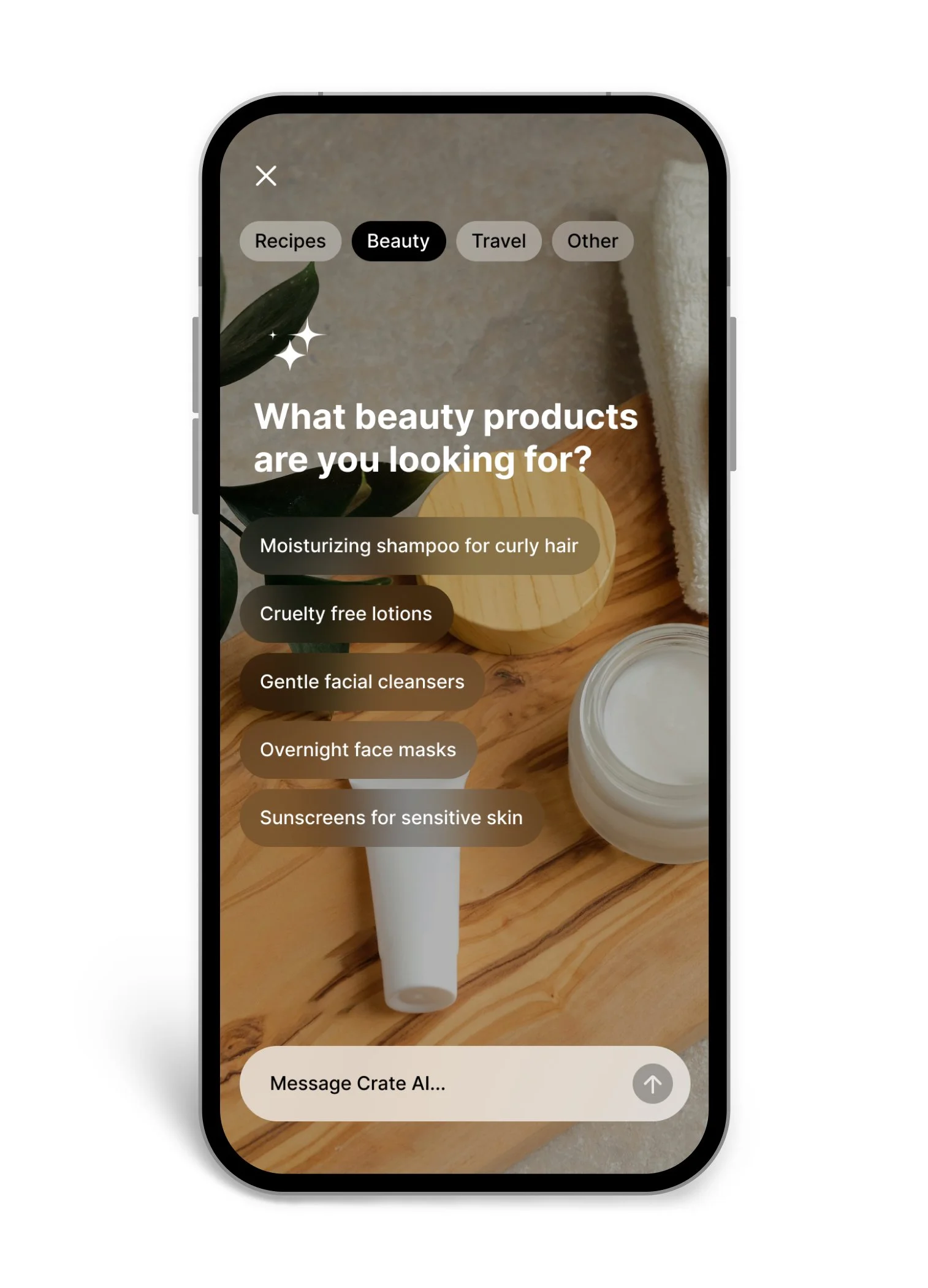
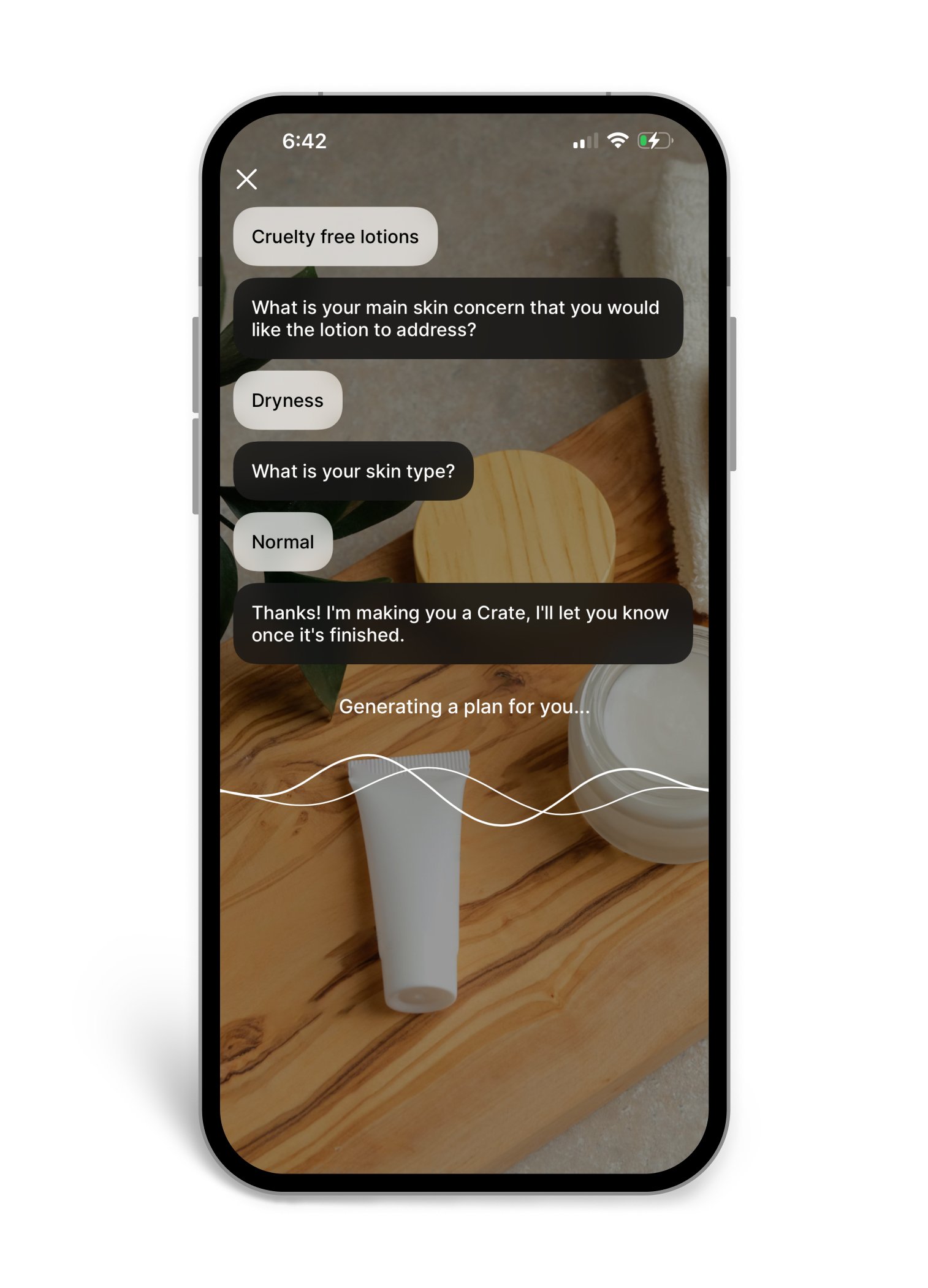
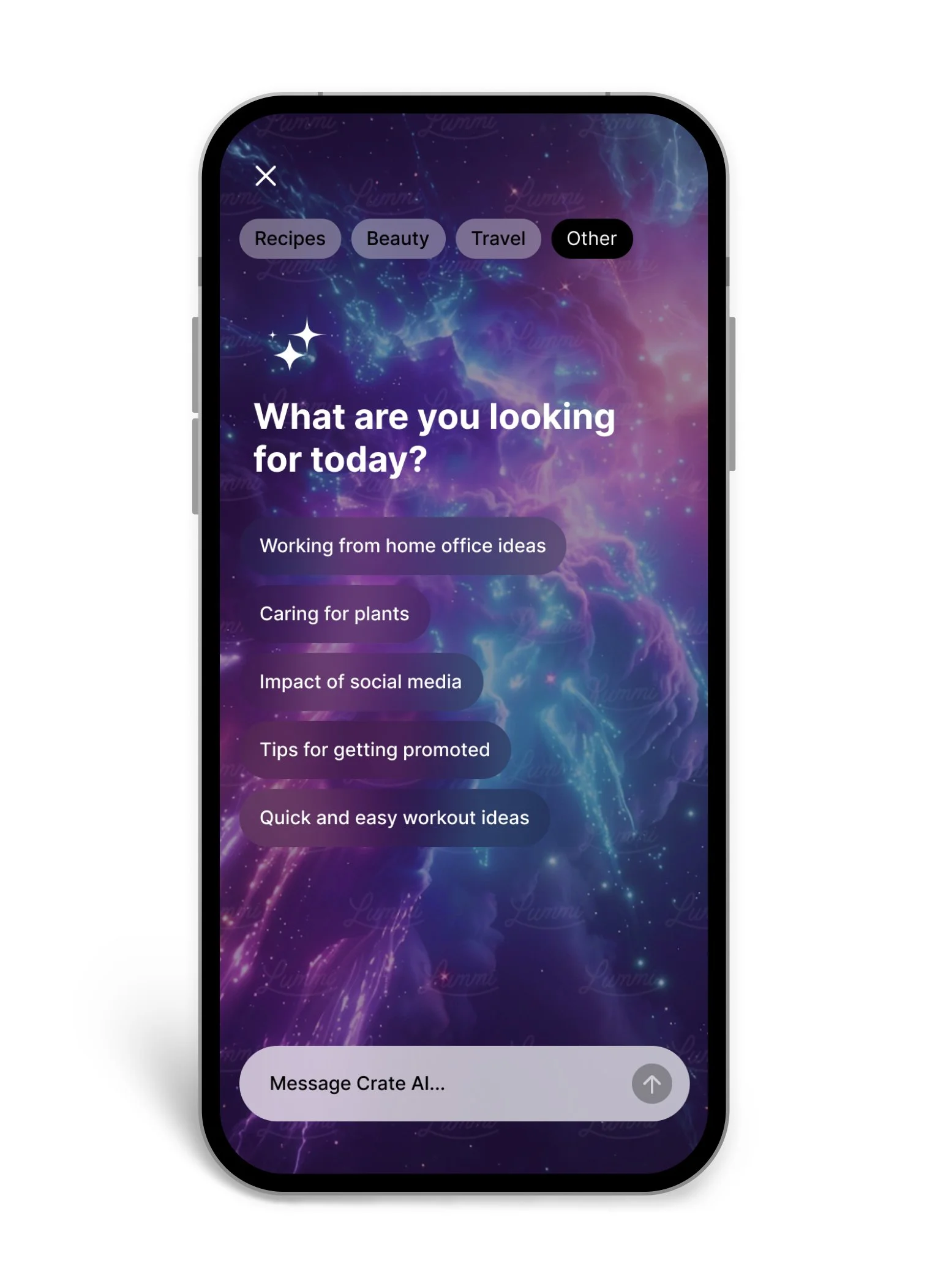
The star of this version was the middle tab, the Crate AI feature: AI-supported search in the form of a structured chat. How does one design a ‘perfect conversation’? What information structure will let us efficiently process queries and offer the best results for the User? How to balance the ease of use with the need for input? It was a great experience building a flow that can help someone find what they need in a minimum number of steps and feels like a visit at a local boutique rather than a supermarket.
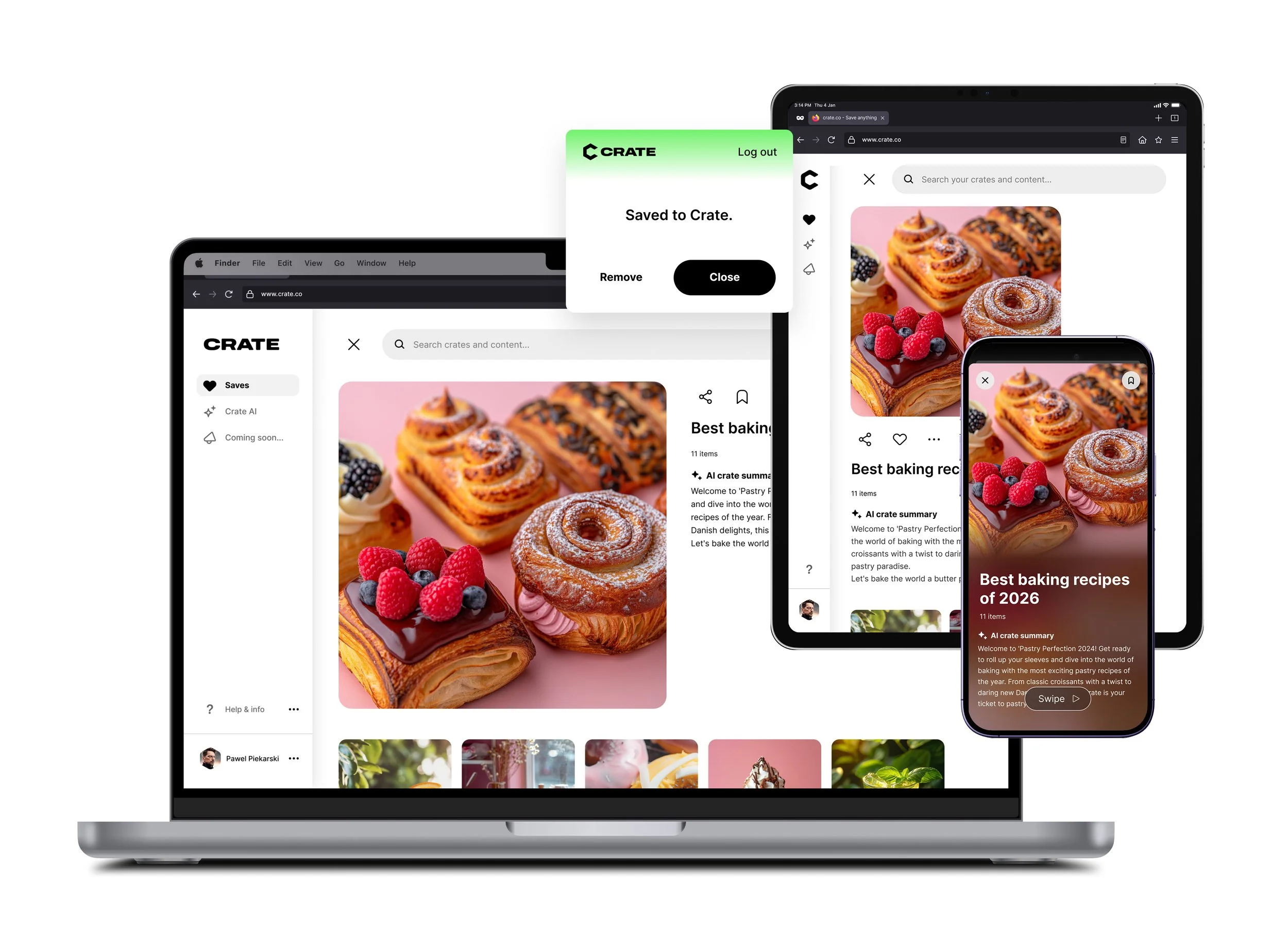
To complete the experience, we've developed a beautiful responsive web version of the app, and a browser plug-in allowing saving anything straight to the app.
It worked, and our core users loved it. In fact, our retention metrics were incredibly strong for those who built a habit. But as we looked at our top-of-funnel data, we hit a wall: user acquisition was painfully sluggish. We realized that 'saving links' was essentially a digital chore—not a compelling enough hook to drive mass-market adoption. To unlock real growth, we needed to shift our core offering from a passive storage utility to a high-value, proactive discovery engine.
MoM Growth
8.3%
Day 30 Retention
37%
Number of Content Saved
1M
Act 2
The Pivot - AI Agent
We realized we were sitting on a goldmine of intent. If we knew what people were saving, we could predict what they actually wanted to discover.
Right around this time, emerging AI technologies became far more accessible and cost-effective. We saw an opportunity to completely flip the script: instead of Crate being a place where you store things, what if Crate became an intelligent agent that finds things for you based on your unique "Taste ID"?
We weren't just a saving app anymore. We were an AI discovery platform!
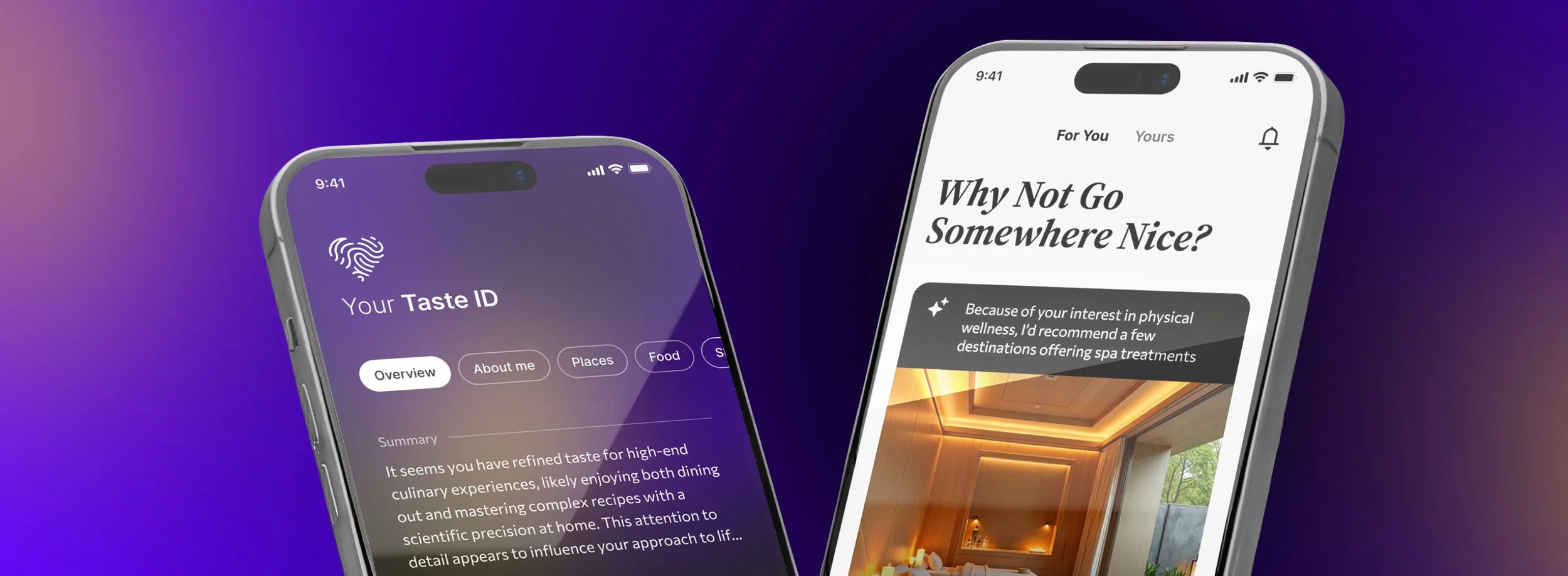
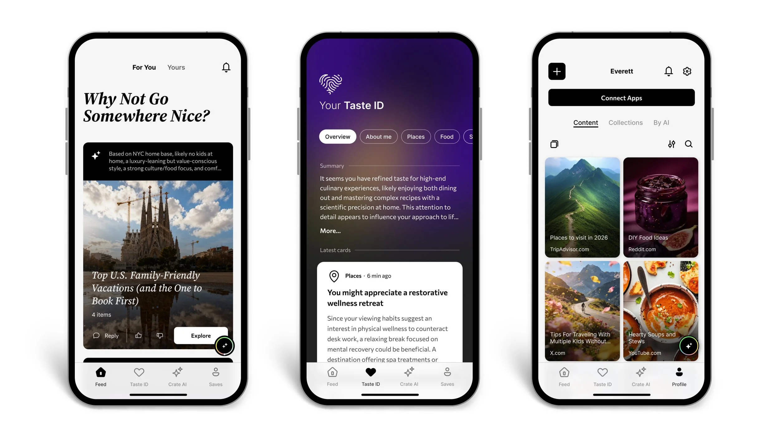
This meant going back to the drawing board. To prevent jarring our existing user base, I maintained our established visual language and card-based UI, but fundamentally changed the information architecture underneath. I introduced the AI not as a separate tool, but as a contextual layer that appeared precisely when users needed it.
It involved not only designing the UI but also tweaking the AI’s tone of voice to create a coherent message and experience. The goal was to make it feel like chatting with a gifted assistant that suggests, helps, and learns with you. Here’s what we’ve built:
High-level Structure
The main challenge here was designing the environment that feels smart and proactive but not nosy. That on top of showing the AI everywhere without it becoming a noise or a nuisance. Not to miss designing UI that adapts to what the AI can do, and invites interaction with said AI. Such a fantastic puzzle!
Agentic AI Feed
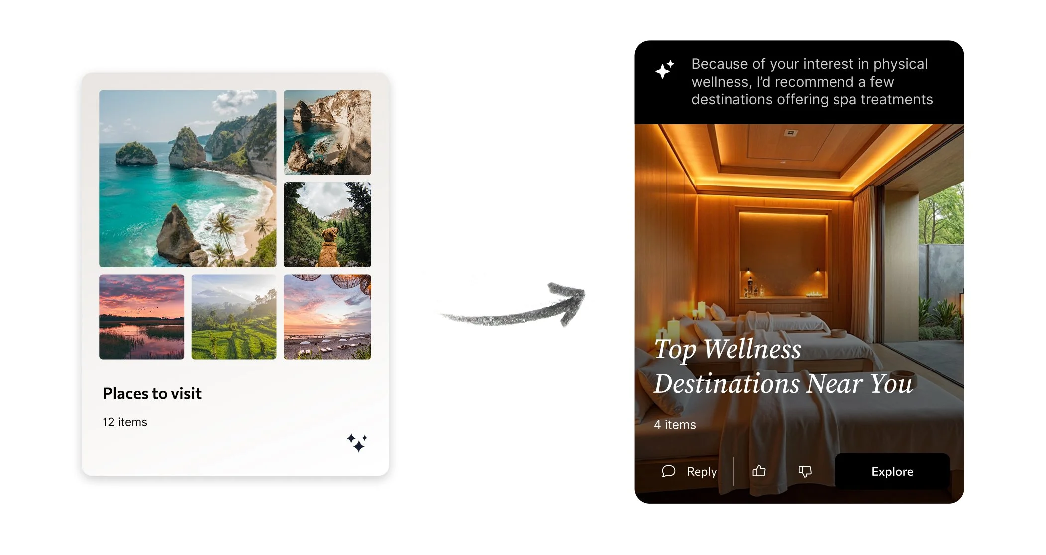
Instead of a passive scrolling experience, I designed the feed to be proactive. The core UX challenge was making AI actions, like building itineraries or curating product lists, feel helpful rather than intrusive. I structured the UI around clear, actionable cards that gently prompt the user, ensuring they always feel in control while turning passive browsing into deep engagement.
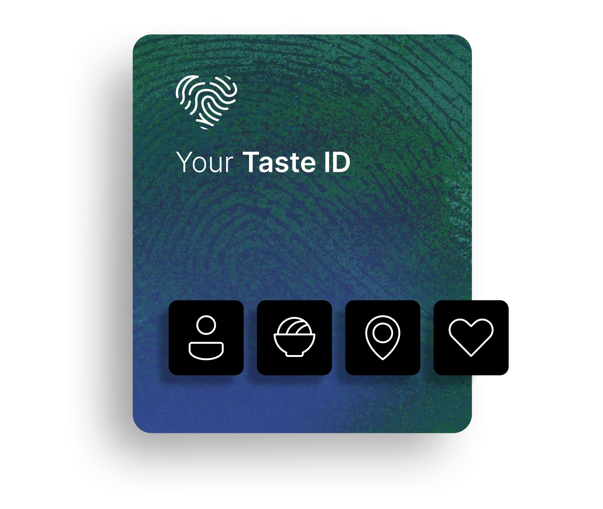
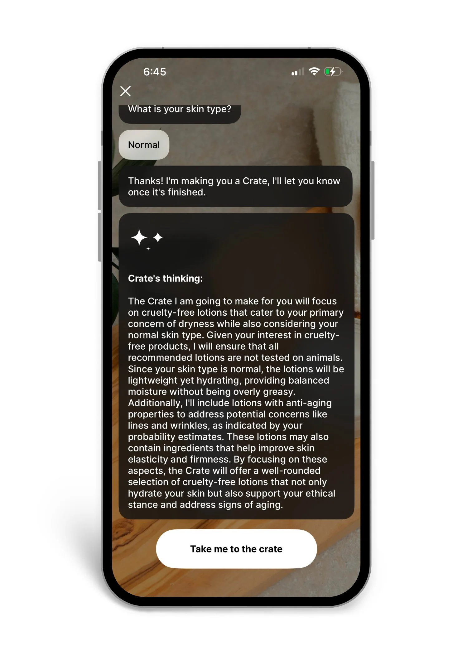
The Taste ID
How do you visualize a trustworthy algorithm? I designed the Taste ID not just as hidden backend logic, but as a transparent, dynamic profile users can actually understand and influence. By designing UI feedback loops that rely on explicit user actions rather than silent surveillance, I helped build an ethical, highly accurate personalization engine that users felt safe engaging with.
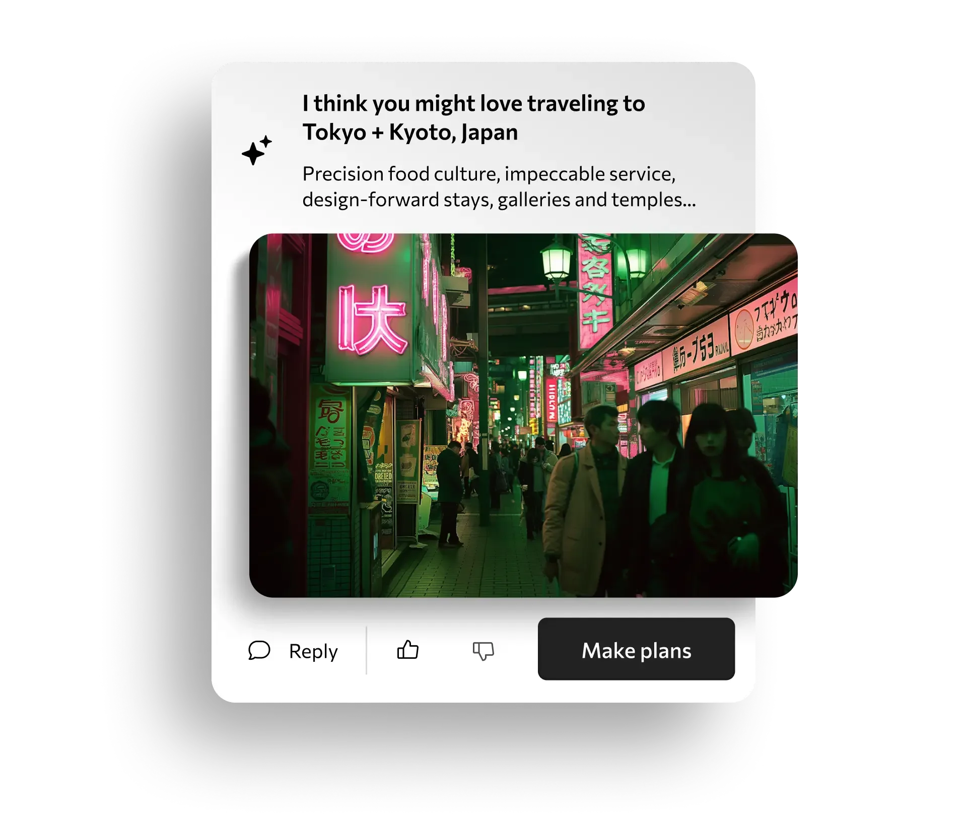
Curated Discovery
To transition users from simply ‘saving links’ to actually using them, I evolved our standard list-based UI into a rich, editorial-style discovery engine. I created a modular design system that adapts to whatever content the AI sources, seamlessly bridging the gap between inspiration and real-world action.
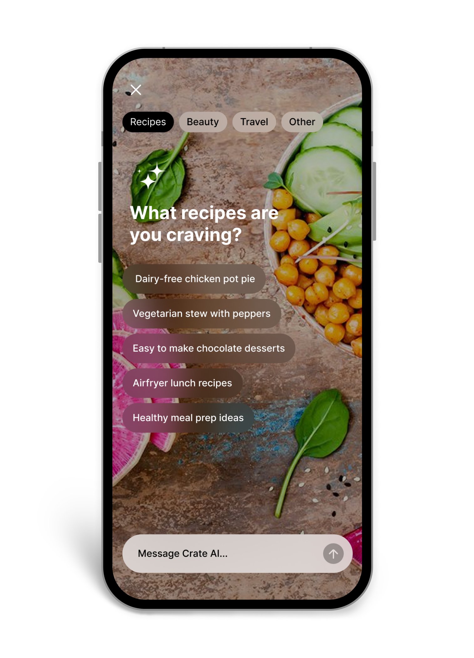
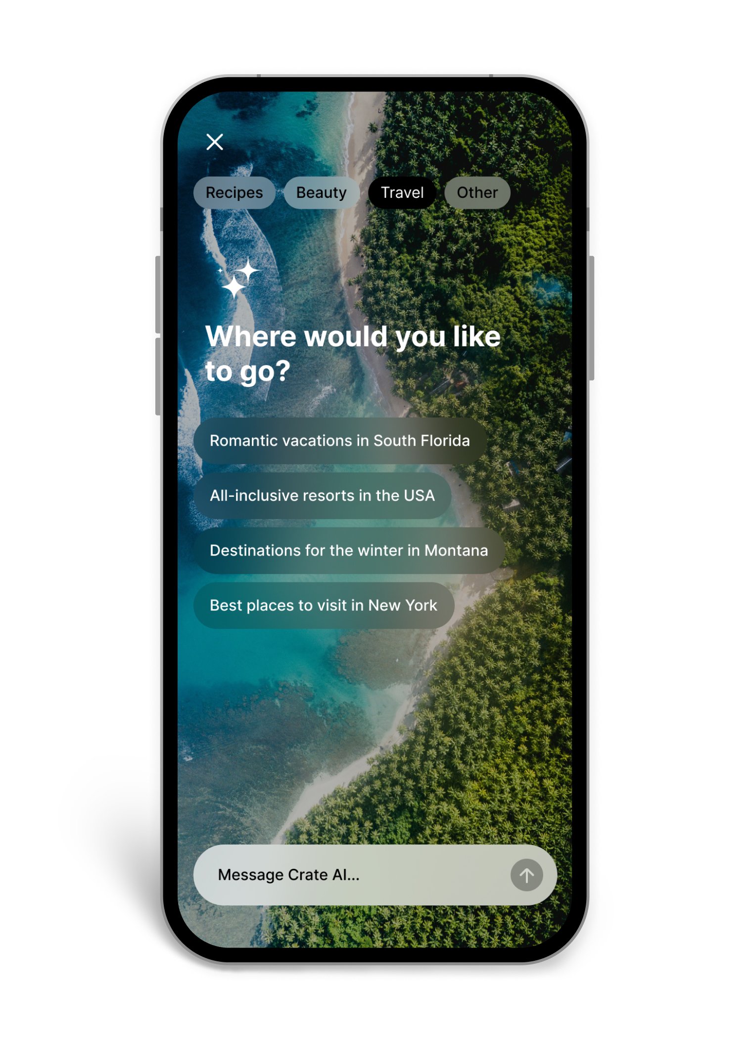
Designing User-First AI UX
Crate users don't have to be tech-savvy or eager to write complicated prompts to enjoy the full functionality and creativity of our AI. My goal was to deliver experiences that flow naturally, and the options appear contextually.
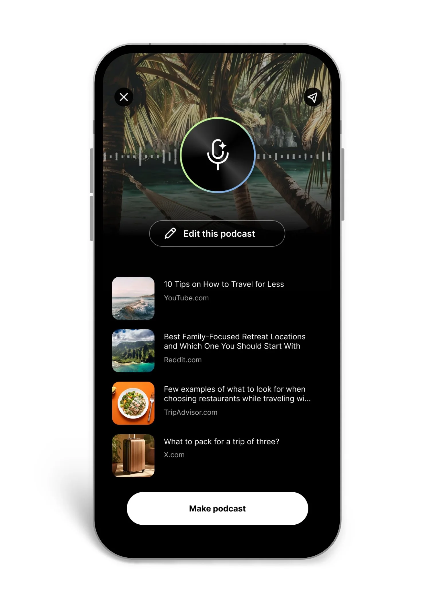
AI Podcast
Audio generation is very complex under the hood, but I firmly believe the user experience shouldn't be. I designed the AI Podcast creation flow to entirely bypass the need for heavy, intimidating text prompts. By leveraging the user's existing saved content, I reduced the barrier to entry to just a few intuitive taps, making multimodal AI creation accessible to anyone.
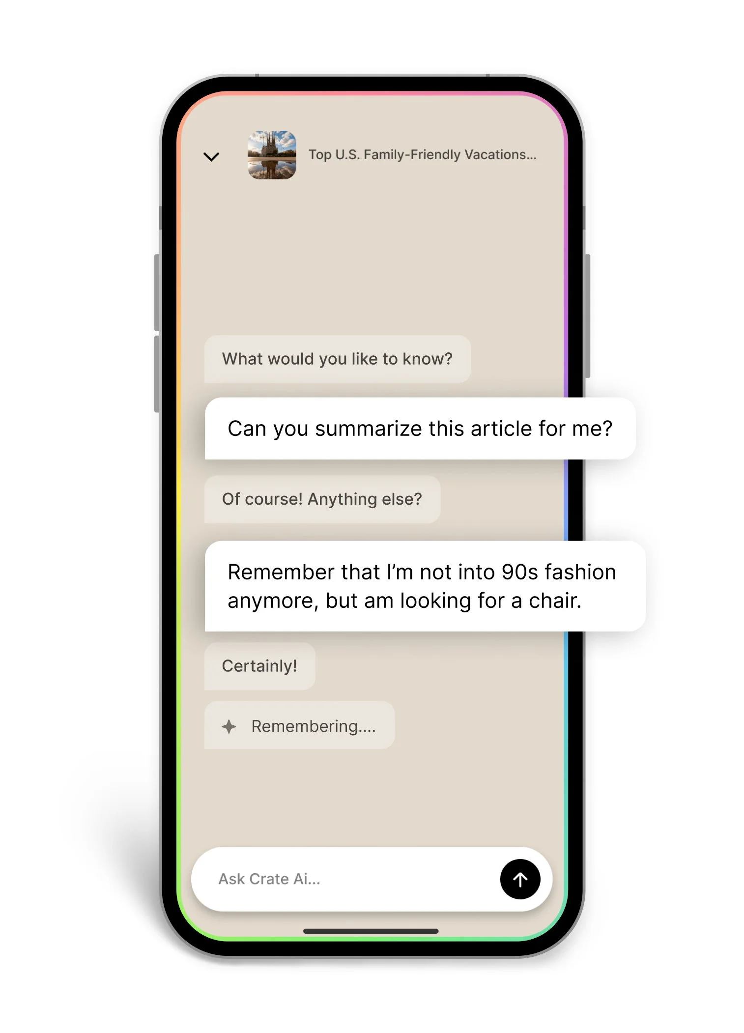
AI Chat
To prevent the 'blank canvas paralysis' users often feel with AI prompts, I designed the chat interface with contextual ice-breakers and suggested follow-ups, making complex two-way algorithms feel like a lightweight, intuitive conversation.
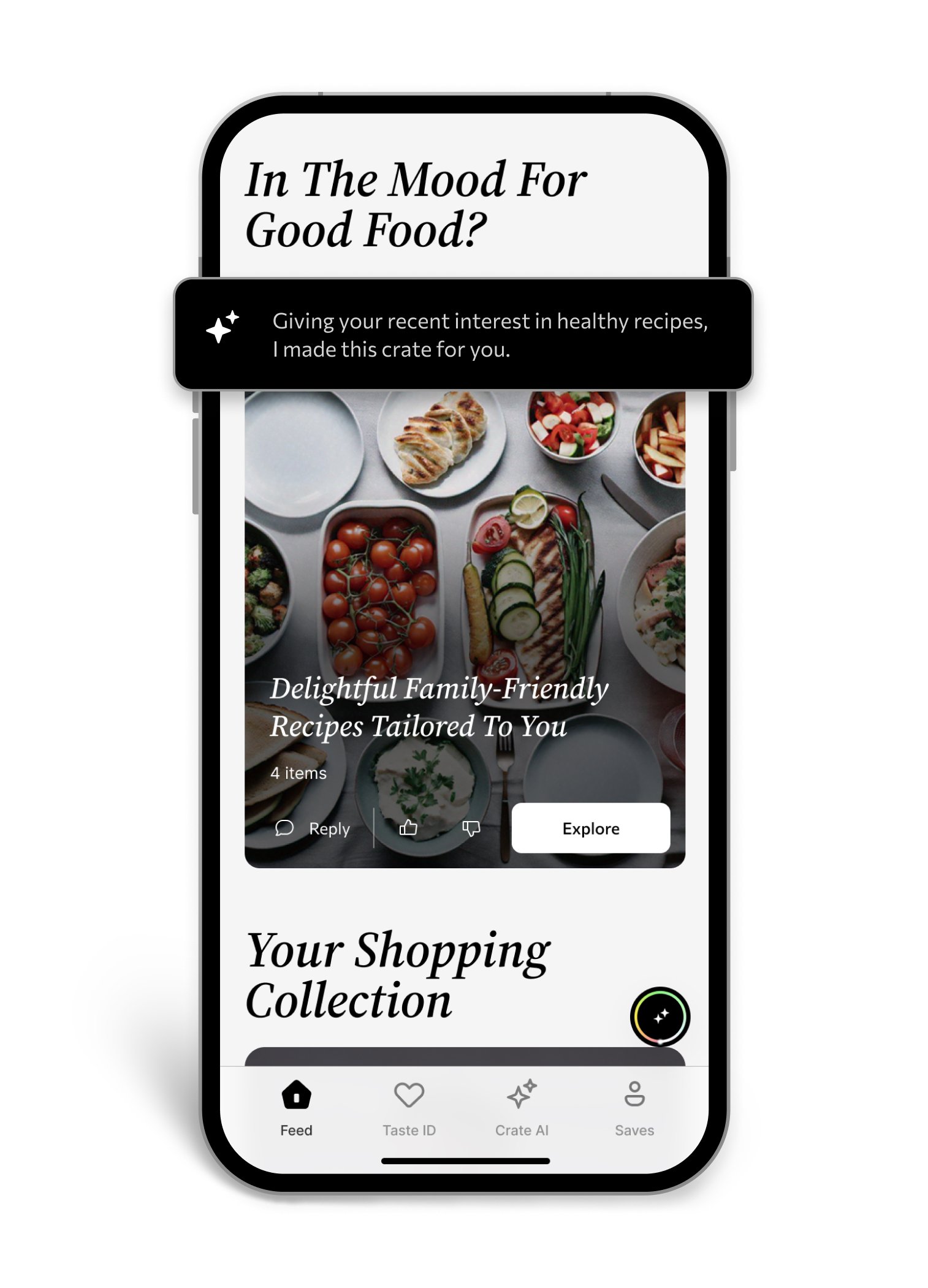
AI Crates
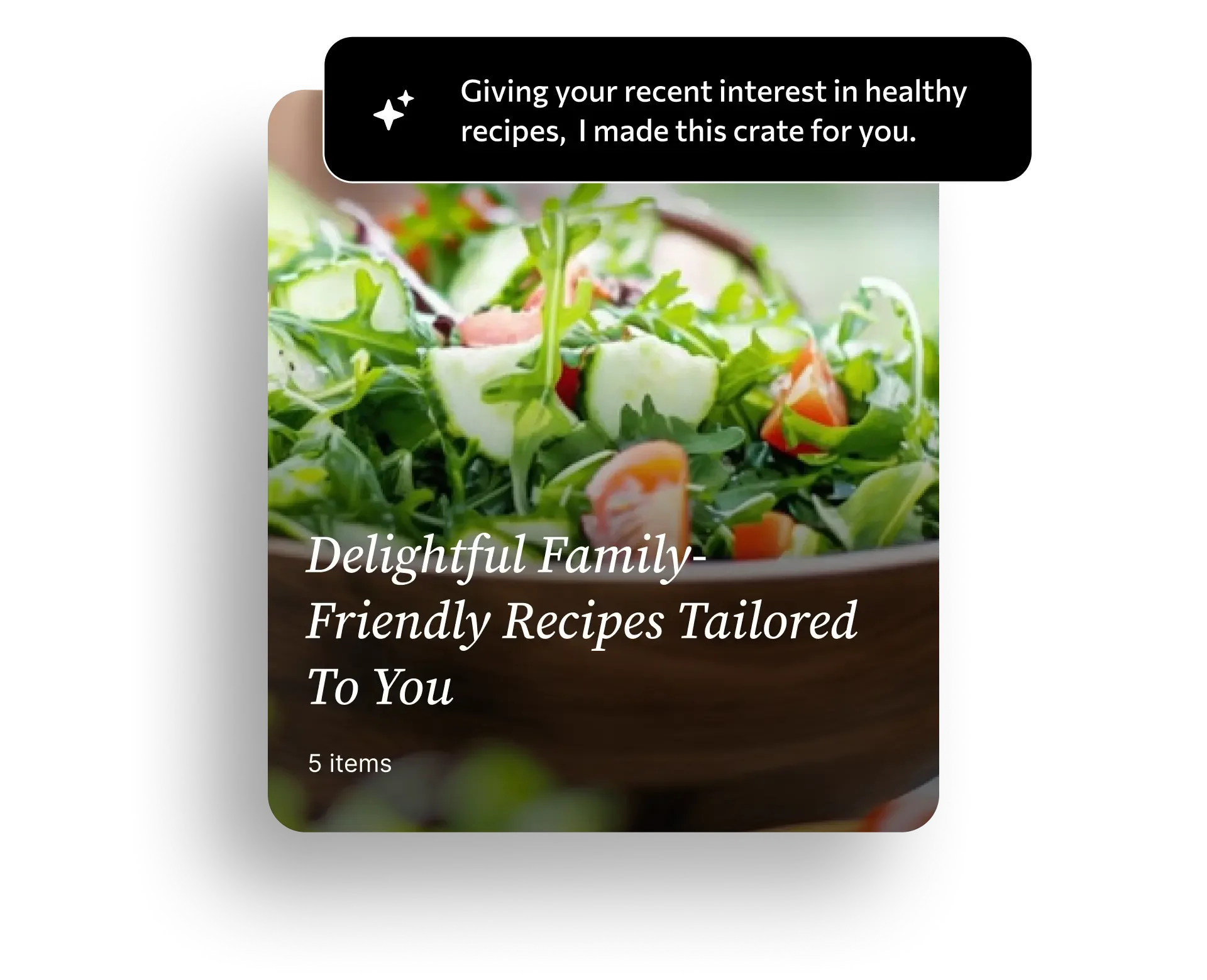
Transitioning to a proactive platform meant the app needed to do the heavy lifting for the user. I designed the 'AI Crates' feature to automatically package relevant content based on a user's Taste ID. The primary design challenge was presenting these auto-generated collections in a way that felt like a delightful, personalized gift, rather than yet another digital clutter.
Retention lift
16%
Session length
12 min
AI Crates adoption
21%
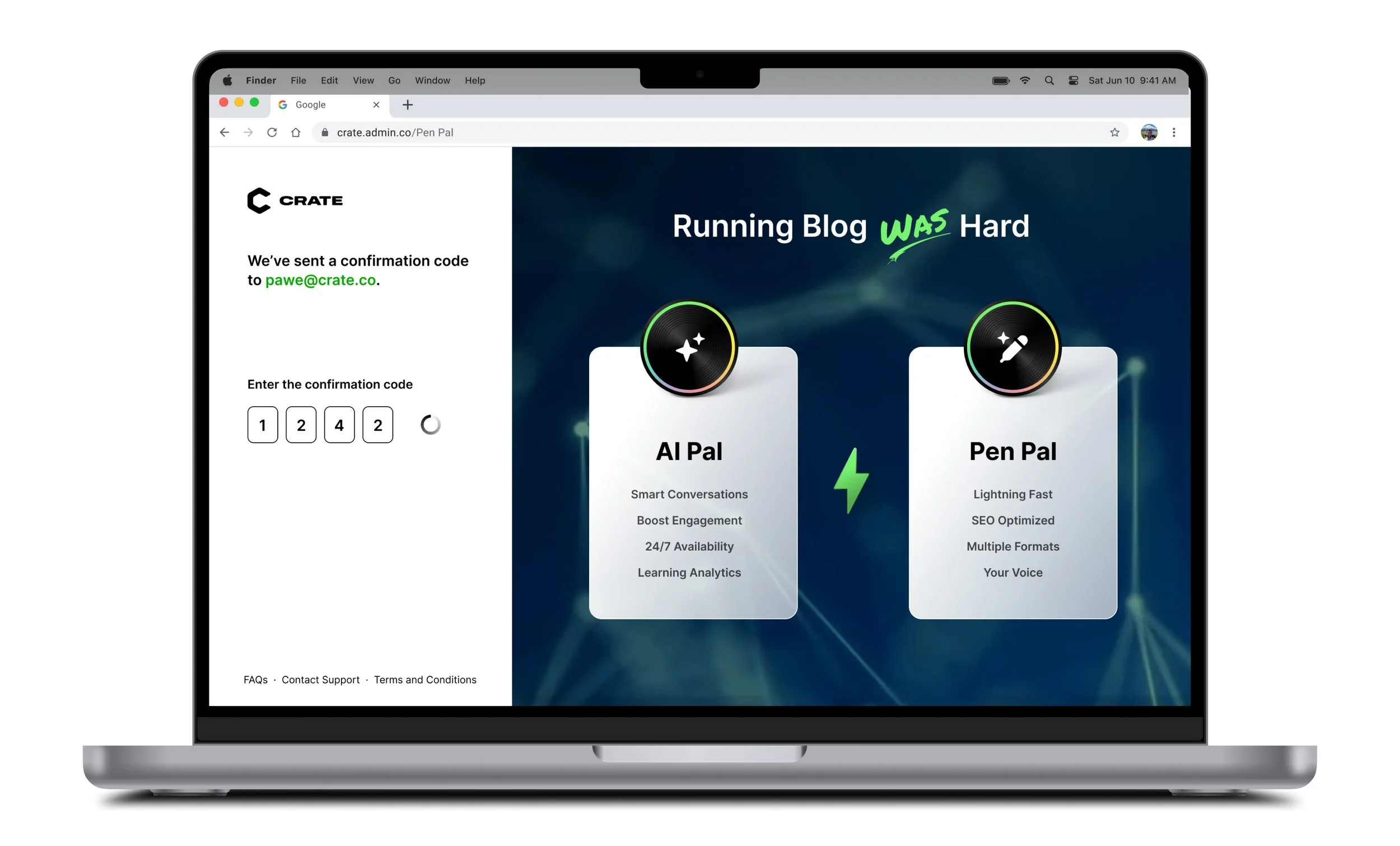
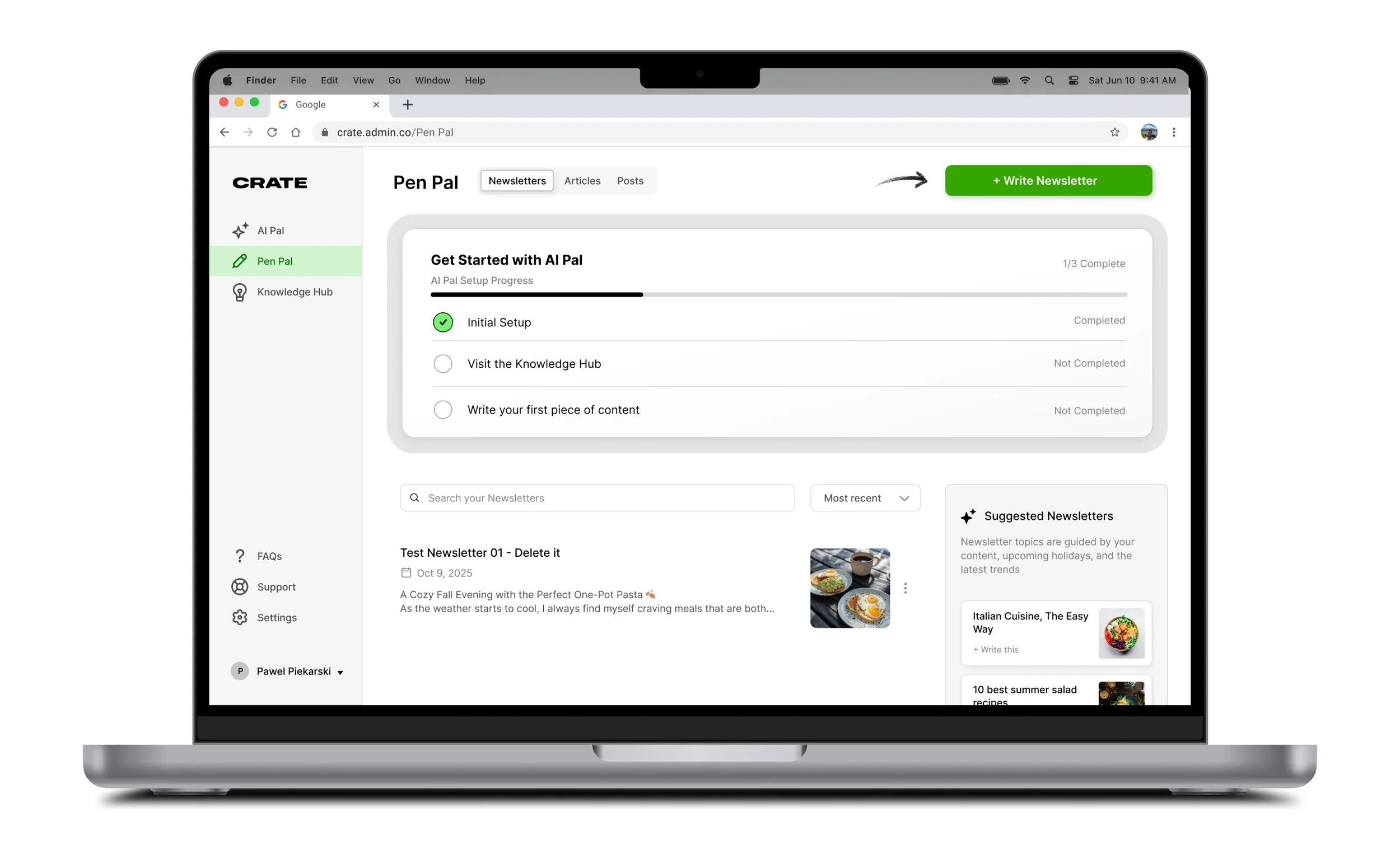
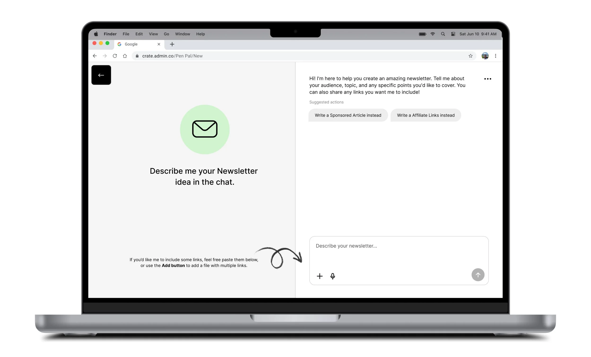
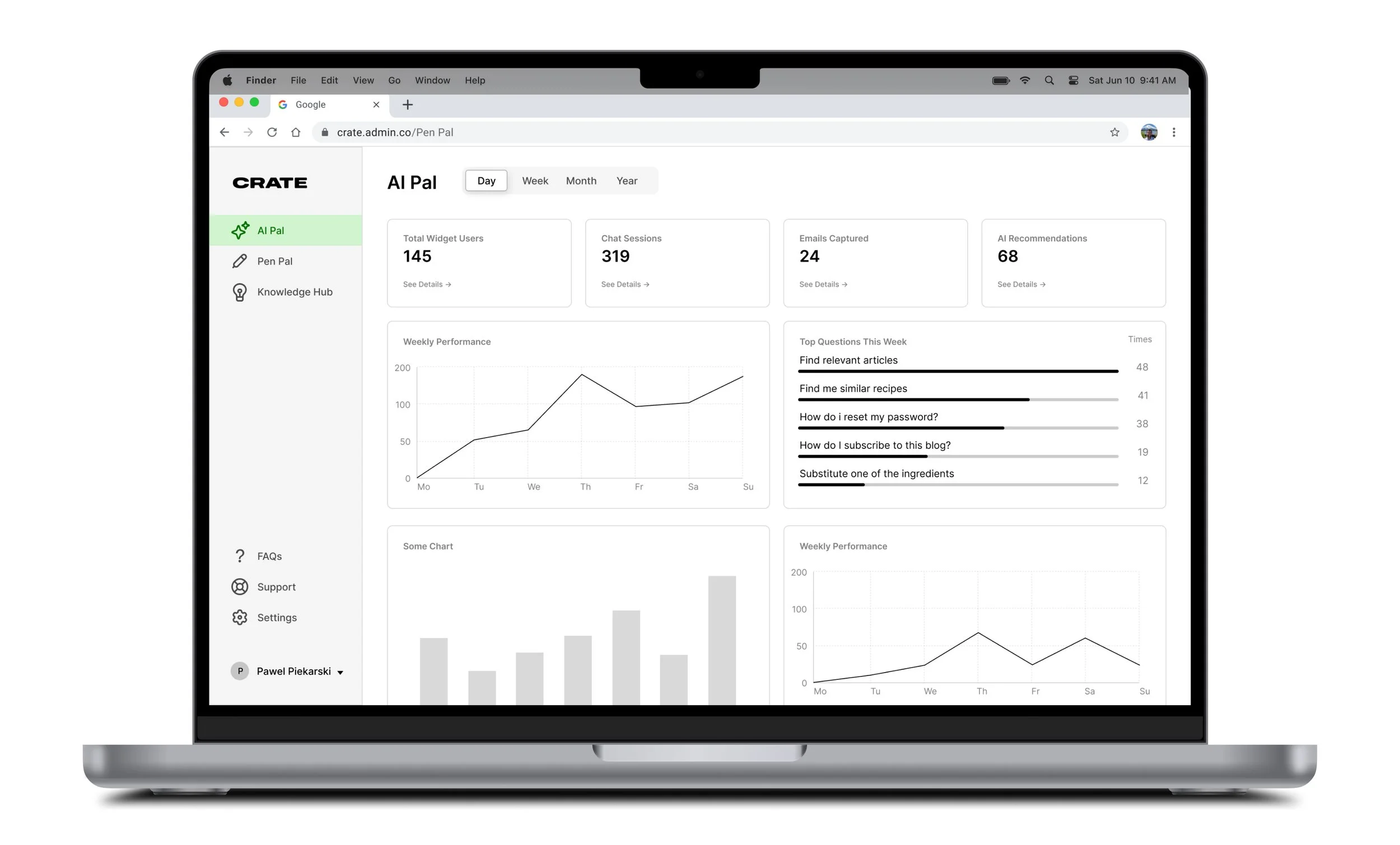
Flexing into B2B:
While our core app was B2C, we saw an opportunity to empower creators. I led the design of an experimental SaaS dashboard for bloggers to track and generate engagement. This required shifting from consumer-friendly UI to data-dense, analytical UX—proving the scalability of our underlying design system. It showed us how flexible both our AI and our Design System are, and taught us how to inject the AI into the experience better.
The Takeaway
Designing Crate over five years taught me that the best products aren't rigid—they breathe and adapt to the market. Navigating the shift from a passive utility to an AI agent required tearing down old assumptions, but it proved that a flexible, modular design system can survive (and thrive) through massive strategic pivots.